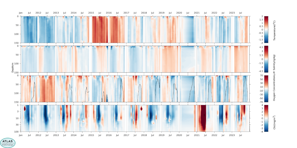
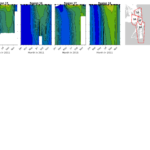
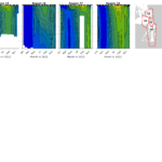
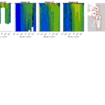
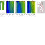
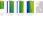
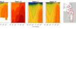
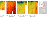
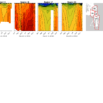
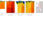
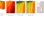
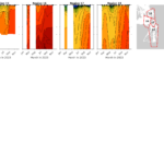
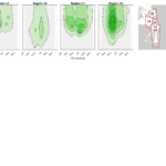
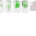
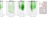
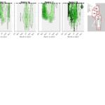
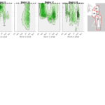
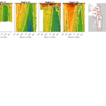
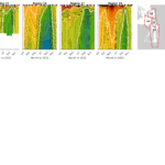
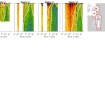
Time-Depth plots of regional variation for Puget Sound
Time-Depth plots of mean and regional Variation for puget sound
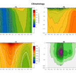
Mean puget sound Conditions for all years
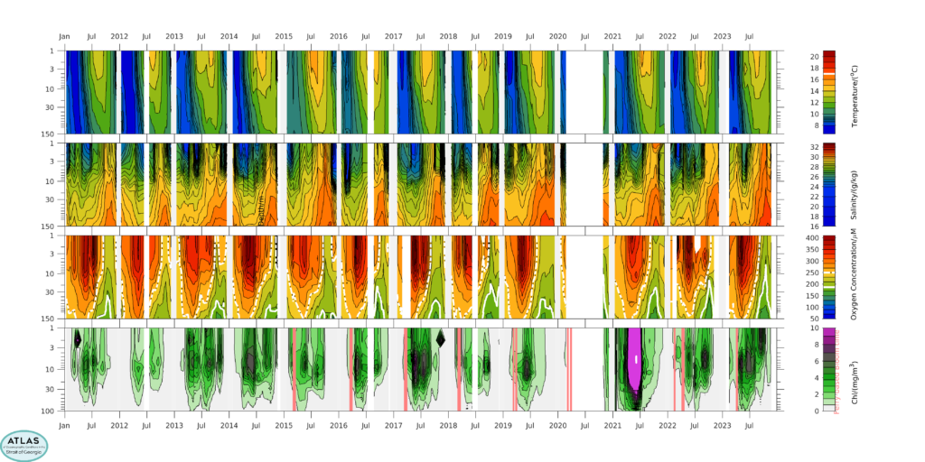
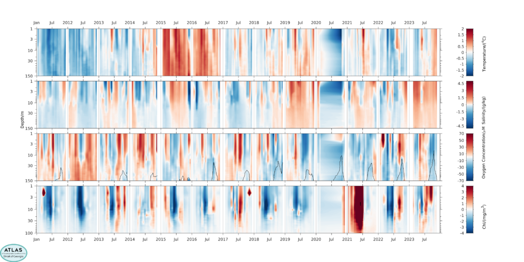
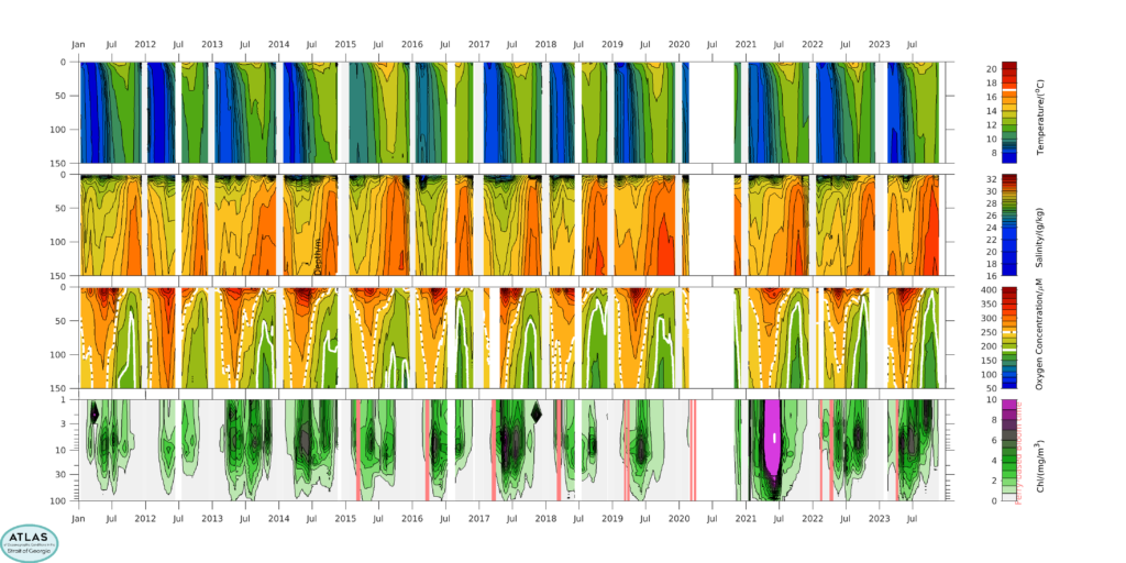
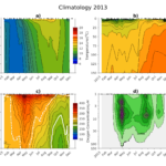
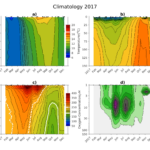
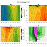
In 2023 we made a preliminary examination of water properties from the southern Gulf Islands, eastern Juan de Fuca Strait, and the Puget Sound Main Basin by obtaining archived data from the Washington State Department of Ecology. Here we present mean conditions in the Puget Sound (averaged over regions 18) for a) temperature, b) salinity, c) dissolved oxygen content, and d) chlorophyll for all years. White lines indicate 17 °C in temperature plots, and 187 µM (6ppm) and 250 µM (8ppm) in O2 plots. Note that the depth axis is linear in depth in the upper plots, but logarithmically scaled in the second row of plots to highlight near-surface details (Chlorophyll plots show the logarithmic depth scales in both sets).
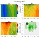
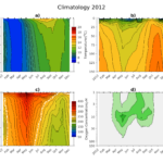
Mean puget sound conditions by year
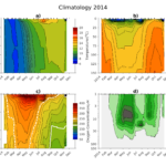
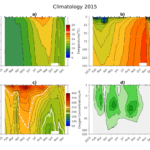
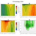
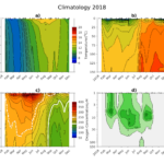
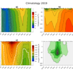
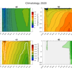
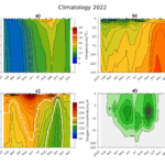
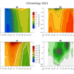
Mean conditions in the Puget Sound (averaged over regions 18) for a) temperature, b) salinity, c) dissolved oxygen content, and d) chlorophyll for each year. White lines indicate 17 °C in temperature plots, and 187 µM (6ppm) and 250 µM (8ppm) in O2 plots. Note that the depth axis is logarithmically scaled in d) to highlight near-surface details.
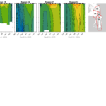
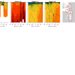
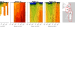
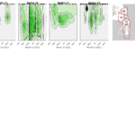
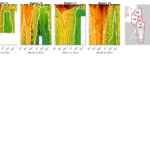
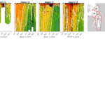
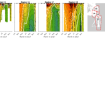
Temperature by Region for All Years
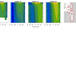
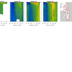
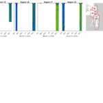
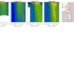
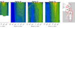
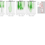
Contour plots for temperature in each region for each year. Black dots at the top of each plot indicate sampling days for that region. The white line indicates 17°C. Region boundaries are given in the map at upper right.
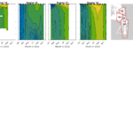
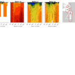
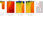
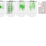
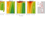
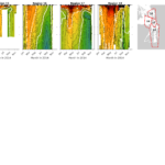
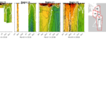
Salinity
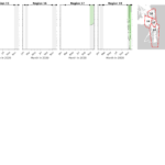
Contour plots for salinity in each region for each year. Black dots at the top of each plot indicate sampling days for that region. Region boundaries are given in the map at upper right.
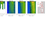
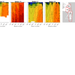
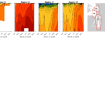
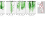
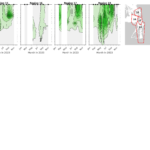
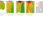
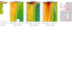
Chlorophyll
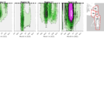
Contour plots for chlorophyll biomass in each region for each year. Black dots at the top of each plot indicate sampling days for that region. The depth scale is logarithmic so that more details can be seen near the surface. Region boundaries are given in the map at upper right.
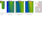
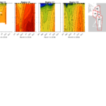
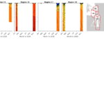
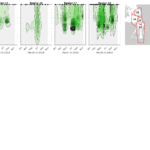
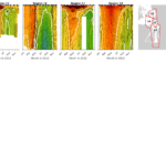
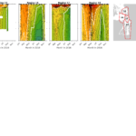
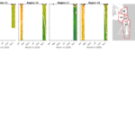
Dissolved Oxygen
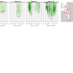
Contour plots for dissolved oxygen concentrations in each region for each year. Black dots at the top of each plot indicate sampling days for that region. White lines indicate 187 µM (6ppm) and 250 µM (8ppm) limits. Region boundaries are given in the map at upper right.


